This armor was in Renaissance Europe, and this material looked like weight and inflexible, and this armor was beautifully decorated. Not only the armor’s function was to protect to people’s body, but also it made to think the beauty in Renaissance period. In Renaissance, this period had developed arts and reproduce arts, so people tried to make their armor more embellished. The Armor usually displayed in tournaments, parades, and triumphal entries, so more strong function was for ornamental purpose. More interesting part was back side. The back side was more functional because they made hip part using fabrics, and that means it would be more comfortable when solider rode a horse. However, back side was also graceful.
Thursday, November 3, 2011
Thursday, October 13, 2011
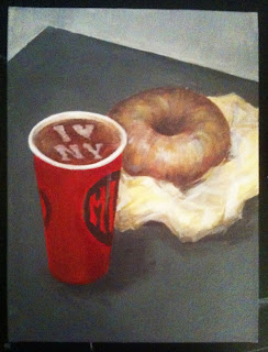
Still Life (New York City)
Paint Still Life ( New York City)
First image of New York City is very busy, and new yorkers seem to be not enough time everyday. In the morning, almost everyone hold cup of coffee and bagle,and it is very common atmosphere in New York City. Therefore, I painted paper coffee cup and bagle, and I think it is a symbol of New York.
First image of New York City is very busy, and new yorkers seem to be not enough time everyday. In the morning, almost everyone hold cup of coffee and bagle,and it is very common atmosphere in New York City. Therefore, I painted paper coffee cup and bagle, and I think it is a symbol of New York.
Friday, October 7, 2011
Paint Three Eggs
Paint Three Eggs under the Sunlight
My concept is the relationsip with objects and light. A front egg is the lighttest one and others are darker than front one. A bottom object(contemporary thing) which is a cloth does not really reflection, so it made more contrast with eggs.
My concept is the relationsip with objects and light. A front egg is the lighttest one and others are darker than front one. A bottom object(contemporary thing) which is a cloth does not really reflection, so it made more contrast with eggs.
Tuesday, September 27, 2011
September 11 (MoMA PS1)
September 11
at the Moma PS1
(The Forty Part motet)
The atmosphere was gloomy and blue at the MoMA PS1 because the subject is September 11. People can see easily the color flags in everywhere, but there were many black flags in the hallway at the MoMA PS1 because of revering the memory of 9/11. It was very impressive. Moreover, one of the impressive exhibitions is The Forty Part Motet (Janet Cardiff, 2001). There were 40 speakers which were singing in the room. It will make an illusion of space which 40 people were singing not the speakers. The sound was very magnificent and consoled for people. This sound was the best strong influence than the other exhibitions.
MoMA PS1 does not allow taking a picture, so the image is from www.ps1.org.
MAKING INFINITY - Lee Ufan (Guggenheim)
MAKING INFINITY – Lee Ufan
at the Guggenheim
(Space for Guggenheim)
Almost every Lee’s sculptures are using by natural stones and steel plates. It emphasizes relationship between natural materials and industrial materials. Interestingly, he made steel plates or steel bars which could change their shapes like curve lines when they contacted with natural resources like stones. It would be harmony between natural and industrial.(Relatum–dissonance, 2009) Also, the amazing painting is space for Guggenheim. It is relationship with environments what is present and absent, made and non-made, visible and invisible, and empty and full. Even though it is almost perfectly pre-planning painting, it looks like simply direct one touch brushed painting. This story is very attractive, and it would be Lee’s purpose.
Guggenheim does not allow taking a picture, so The images are from www.Guggenheim.org. and contemporaryartdaily.com
Thursday, September 22, 2011
Color Wheel
Color Wheel
It was difficult to make accurate color,
and when I mixed two color, it was getting darker and darker.
So I put a little white color, but it looked little strange color.
It was difficult to make accurate color,
and when I mixed two color, it was getting darker and darker.
So I put a little white color, but it looked little strange color.
Tuesday, September 13, 2011
9/23 Witness- A Look Back to the future
Robert Selwyn
-Airplane #1, 911 Explosion, and Airplane #2, 2001
oil on canvass

These paintings explained directly ways of WTC. In the exhibition
display, the arrangement also maximized the terrible atmosphere
because these two airplanes seem to go straight to the building.
I think that the black and white color illustrated depression.
The painting touch looks like very soft, but related with color produce
an atmosphere of terror.
-Airplane #1, 911 Explosion, and Airplane #2, 2001
oil on canvass

These paintings explained directly ways of WTC. In the exhibition
display, the arrangement also maximized the terrible atmosphere
because these two airplanes seem to go straight to the building.
I think that the black and white color illustrated depression.
The painting touch looks like very soft, but related with color produce
an atmosphere of terror.
Subscribe to:
Posts (Atom)


