Friday, December 16, 2011

Hiroko Ohno


 Her art studio was very impressive because I can learn Japanese traditional painting such as materials. Her art works were very naturalistic, and colors compositions were very comportable.Also there were many animals such as fishs, flogs, it was very cute ans witty. One more thing, I was interesting that she was not drawing to see the pictures, that meant she always go to somewhere, and she draws landscapes which are oniginal places. She might think the original environments are important for her art works.

sketchbook

sketchbook

Metropolitan Museum


When I was drawing Metropolitan Art works, art works were very beautiful and amazing such as colors or details, so I learned harmony of colors and compositions especially african art works. Moreover, arms and armors sections were very impressive because I couldn't believe the details and beauty during this period much more like nowadays skills. 

Wednesday, December 14, 2011

artist interview

Jason Lee


There is a Louis Vuitton Dog which printed a lot of logos in the body, and it looks like displayed the Louis Vuitton shop. However, it made by a Korean Artist who is Jason Lee. He has lived in New York almost 6years, and he was born in South Korea. His major was a printmaking in Hong Ik University which is one of the most famous art schools in South Korea. He is a sculptor, but he looks like a performance artist because he makes people happy, and also his belief is that he wants to live for happiness.

          When he was young, he is always playing on the natural place such as mountain or river because he lived in country side, not cities. He loved to stay on the mountain, and his toys were animals and plates, so his most of subjects were natural resources such as fishes, flogs or bugs when he was drawing early period. However, his skill was very unique. He used fire to burn on the wood panels and made shapes, but first time he couldn’t control the fire. Finally, he figured out that water can control fire, so he made detail shapes with water and fire. It is very impressive skill.  
                                                         Jason Lee (2007), the Flogs


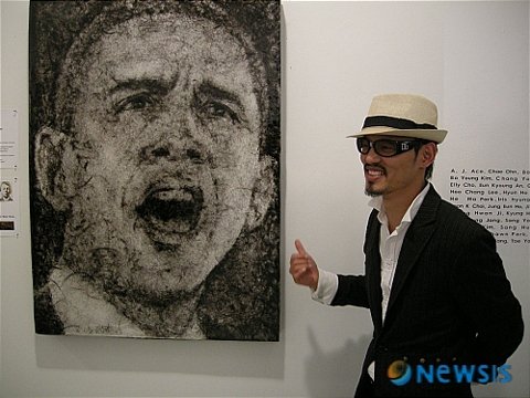
His one of the most important turning point was the president Barack Obama Exhibition in 2008. It made him more famous and had more confidence. It was a group exhibition which supported for Obama before he became president. He sold the portrait of Obama and he met his supporter. The material was also very distinctive than others because he used human hairs to made president’s face. He said that he wants to choose material which is not selling in art supply stores, and he wants to find material in everyday life. It was very contrast between black and white, and it stands out his idea of expression.


                                          Jason Lee (2008) Barack Obama


Recently, he began to put his message into his artwork strongly. Previous told the Louis Vuitton dog, it includes the message, protecting the animals. When he was young he always frolicking with small animals, but he realized that he wanted to stay with them, they would be sick or die soon than original natural place. Therefore, he thinks that people take care about pets, but it is only for people, not for animal. However, people cannot realize that. For example, people dressed their dogs in the clothes, but they were satisfied for themselves not for dogs. His message was based on his youth experiences, and he tried to tell everyone.


                                           Jason Lee (2010), Louis Vuitton Dog.


He loves natural environment, and he does not like ordinary. When he works, he always fined fun for the work and life, and he think the most important is happiness. I hope his message would spread out world wide, and I will wait next his remarkable work.

Monday, December 5, 2011

BAD DRAWING

A. Deformation of the figure
I admire Margritte's "Cloud". If we made the cloud chair, it will be sofe and comfortable like siting on the cloud.

B. Art resource
It is one of art work at african art section in Metropolitan Museum.

C. Non-art resource
The computer. People use a computer everyday life, so it is very important for people.

D. Fantastic content


Snack House
When people were young , they would be dreaming in Sanck house like a fairy tail, Hansel and Gretel.

Friday, December 2, 2011

9/11 Memorial


9/11 Memorial Park

9/11 memorial was built by architect Micheal Arad who is an Israeli- American, and is a tribute to the memorial for almost 3,000 people who died in the attacks of September 11, 2001. The name of the architecture is The World Trade Center Memorial with “Reflecting Absence” There are two huge artificial pools, north pool and south pool.

Firstly, the interesting thing is the organization of names by architect Micheal Arad. Usually, people organize the many names by alphabet standard, but these pools, which have victims’ names on the bronze panels edging of the pool, are arranged according to familiarity. This meant that some of the victims worked together or were related to each other, so it was a thoughtful design. Arad (Wikipedia, 2011) said in the statement, "This design proposes a space that resonates with the feelings of loss and absence that were generated by the death and destruction at the World Trade Center." The designer thought more carefully about the victims, and their families.

Secondly, the pools’ shape is very abstract design using a square inside another square. The shapes can be images of twin towers which were attacked by airplanes. People maybe want to memorialize the towers and the victims. The author (9/11 Memorials and Remembrance, 2011) said , “The footprints of the original World Trade Center towers have been turned into two square, below-ground reflecting pools, each nearly an acre, fed from all sides by waterfalls that begin just above ground level.”

9/11 memorial shows what is important for the victims, their families, and over the worlds. The architectures illustrate to memorialize to the people and the buildings.  


 Citation

Micheal Arad (2011),Wikipedia.


9/11 Memorials and Remembrance (2011), The New York Times.

Retrieved from http://topics.nytimes.com/top/reference/timestopics/subjects/s/sept_11_2001/memorials/index.html?scp=1&sq=reflecting%20absence&st=cse

David Smith


David Smith: CUBES AND ANARCHY

David Smith (1906-1965) is a sculptor in the United States. His sculptures are geometric forms such as squares and circles, and he also used industrial materials and technique. He admired European abstract artists in particular Constantin Brancusi who was one of the Russian constructivists and Piet Mondrian who was the Dutch De Stijl painter.

First, his sculpture, The Hero (1951-1952) shows that he is interested in the human figure because he used a geometric Vocabulary and explained the human body in the form of rectangular and triangular. The author (The Brooklyn Museum, no date) states that, “She is revealed frontally, balanced on a pedestal, with a rectangle for a torso, two triangular forms for breasts, and fragments of a tank top for a head.” If there were no explanation, many people could not realize the hero was a woman, so it was very simple and eliminated expression. The sculpture was a full size of woman, and it was totally balanced, he emphasized the balance of the sculpture.

Second, his sculpture, Tanktotem VII (1960) is one of the Tanktotem series. It incorporated part of a manufactured boiler tank. Eliel (David Smith in Focus: Tanktotem VII, 2011) mentioned that “Cubes and Anarchy looks at Smith’s self-constructed blue-collar identity and his interest in the artistic vocabulary and the beliefs of early modernists who saw basic geometric form as a way to express their utopian optimism”. His sculpture expressed only black and white colors, and it was abstract color and it would divide space and mind in that society.

David Smith’s sculptures are very geometric and use industrial materials because he wanted to show the power and scale of modern life. Moreover, he created the synthesis to redefine the aesthetic and ambition.


Citation

Collection: Contemporary Art: The Hero (no date), The Brooklyn Museum.

Retrieved from http://www.brooklynmuseum.org/opencollection/objects/1170/The_Hero


Eliel Carol S. (2011) David Smith in Focus: Tanktotem VII,The Lacma Blog.

Retrieved from http://lacma.wordpress.com/2011/05/02/david-smith-in-focus-tanktotem-vii/

Thursday, November 3, 2011

Metropolitan Museum

Armor


This armor was in Renaissance Europe, and this material looked like weight and inflexible, and this armor was beautifully decorated. Not only the armors function was to protect to peoples body, but also it made to think the beauty in Renaissance period. In Renaissance, this period had developed arts and reproduce arts, so people tried to make their armor more embellished. The Armor usually displayed in tournaments, parades, and triumphal entries, so more strong function was for ornamental purpose. More interesting part was back side. The back side was more functional because they made hip part using fabrics, and that means it would be more comfortable when solider rode a horse. However, back side was also graceful.  

Thursday, October 13, 2011

Still Life (New York City)

Paint Still Life ( New York City)


First image of New York City is very busy, and new yorkers seem to be not enough time everyday. In the morning, almost everyone hold cup of coffee and bagle,and it is very common atmosphere in New York City. Therefore, I painted paper coffee cup and bagle, and I think it is a symbol of New York.

Friday, October 7, 2011

Paint Three Eggs

Paint Three Eggs under the Sunlight


My concept is the relationsip with objects and light. A front egg is the lighttest one and others are darker than front one. A bottom object(contemporary thing) which is a cloth does not really reflection, so it made more contrast with eggs.

Tuesday, September 27, 2011

September 11 (MoMA PS1)


September 11
at the Moma PS1

(The Forty Part motet)


The atmosphere was gloomy and blue at the MoMA PS1 because the subject is September 11. People can see easily the color flags in everywhere, but there were many black flags in the hallway at the MoMA PS1 because of revering the memory of 9/11. It was very impressive. Moreover, one of the impressive exhibitions is The Forty Part Motet (Janet Cardiff, 2001). There were 40 speakers which were singing in the room. It will make an illusion of space which 40 people were singing not the speakers. The sound was very magnificent and consoled for people. This sound was the best strong influence than the other exhibitions.    


MoMA PS1 does not allow taking a picture, so the image is from www.ps1.org.  

MAKING INFINITY - Lee Ufan (Guggenheim)


MAKING INFINITY Lee Ufan
at the Guggenheim


 (Relatum–dissonance)


(Space for Guggenheim)


Almost every Lees sculptures are using by natural stones and steel plates. It emphasizes relationship between natural materials and industrial materials. Interestingly, he made steel plates or steel bars which could change their shapes like curve lines when they contacted with natural resources like stones. It would be harmony between natural and industrial.(Relatum–dissonance, 2009) Also, the amazing painting is space for Guggenheim. It is relationship with environments what is present and absent, made and non-made, visible and invisible, and empty and full. Even though it is almost perfectly pre-planning painting, it looks like simply direct one touch brushed painting. This story is very attractive, and it would be Lee’s purpose.


Guggenheim does not allow taking a picture, so The images are from www.Guggenheim.org. and contemporaryartdaily.com

Thursday, September 22, 2011

Color Wheel

Color Wheel

It was difficult to make accurate color,
and when I mixed two color, it was getting darker and darker.
So I put a little white color, but it looked little strange color.

Tuesday, September 13, 2011

9/23 Witness- A Look Back to the future

Robert Selwyn

-Airplane #1, 911 Explosion, and Airplane #2, 2001
 oil on canvass


These paintings explained directly ways of WTC. In the exhibition
display, the arrangement also maximized the terrible atmosphere
because these two airplanes seem to go straight to the building.
I think that the black and white color illustrated depression.
The painting touch looks like very soft, but related with color produce
an atmosphere of terror.